Showing posts sorted by relevance for query Optical Scentsibilities. Sort by date Show all posts

Monday, December 16, 2013

Optical Scentsibilities: the Kiss by the Piano or The History of the Tabu Vintage Perfume Ads

Who hasn't been swept by the passion of the old Tabu by Dana perfume advertisements showing a female pianist passionately embraced and kissed by a male violinist? "Tabu, the forbidden fragrance" ("un parfum de puta", as per the fragrance brief to perfumer Jean Carles, no less) recounted to the reader that "Things  don't happen the way they used to. But they still happen." Kinda Fabbio-jacket cover dreamy, eh? In fact more artistic than initially thought of, so a great subject for our Optical Scentsibilities feature exploring the connection between art history & perfume images.


Tabu the fragrance, coming out in 1932, isn't that far removed from the painting that actually inspired the iconography of this advertisement, which is The Kreutzer Sonata painting by René François Xavier Prinet in 1901. (Itself inspired by the homonymous Leo Tolstoy novella which dramatizes a husband's jealous rage over a wife's "animal excesses" and making a case for sexual abstinence, the literary artwork itself referencing Beethoven's Kreutzer Sonata, originally dedicated to the violinist George Bridgetower who by insulting the morals of a woman in Beethoven's admired list lost the dedication to his peer, Kreutzer. Talk about meta-galore and war of the sexes on this one!)

via wikipedia commons

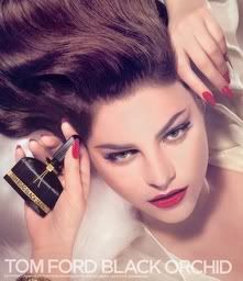
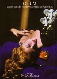
The specific advertisement depicted on the top is only one generation ahead of the original perfume launch (please note all the ancillary products mentioned at the bottom, such as soap, dusting powder and lipstick the Tabu brand has under its belt), but boy, how had mores changed in the interim!

Tabu continued on the path of the "painting like" advertisements and has a pleiad of vintage perfume ads (as shown on a dedicated blog from 2009). Among my favorites is this one, showing a woman in front of the iconic painting, cleverly referenced in the background, reading "When Tabu becomes a part of you, you become apart from all others". (ain't that the truth!)


Finally Tabu reprised the violinist with a nude male model posing for a 1990s fashions-clad woman painter (what a genius meta-meta-comment on Dana's part!)

The transcription of the values and tropes of oil paintings into perfume advertising in particular is stunning, straddling the contradictory notions of wealth and spirituality. Using the work of art as a quote acts as a potent sign of cultural authority; in a way it confirms the wisdom and appraisal ability of the viewer and acts as a reminder of being a cultured European (or a cultured partaker of the European values of aesthetics, at the very least)

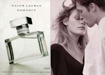
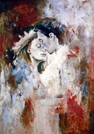
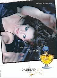
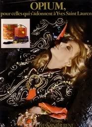
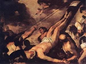
This post today brings me nicely to the observation that I had made in a previous installement of the Optical Scentsibilities articles exploring the ties of perfume advertising and art history that sometimes the image you see is not only "inspired" by a painting/iconic photo (such as "Las Meninas" did for Paco Rabanne pour Homme or the Madame de Pompadour painting by Francois bouchet did for countless "reclining" poses in recent perfume ads) but it accurately reproduces the art work down to the smallest detail, as was the case with The Divers (utilized by Guy Laroche for Horizon). or Watteau's "The Swing" reprised in 1999 by Estee Lauder for Pleasures perfume featuring their model at the time Liz Hurley.

via ebay

via wikimedia commons
A timely reminder that perfume imagery isn't as frivolous and low-brow as initially thought of.


Friday, November 2, 2007

Optical Scentsibilities -new feature!

Perfume Shrine has an eye for the visual as well as a nose for the olfactual, as has surely been apparent to our readers by now. In the interests of pursuing the investigation of common themes running through perfume images, a new feature is introduced: Optical Scentsibilities. A feature focusing on elective affinities among images concerning fragrances that will run regularly from now on.

The idea came up while releafing my art books, which abundantly depict what Umberto Eco has so infamously made an academic career out of: semiotics, of course. Like "books talk about other books", images draw inspiration from other images and perhaps instill a new twist on an older theme. In this sense there is no purpose of talking about "plagiarism", as it is well established that there can be no parthenogenesis in art. Basically, everything has already been said and there is nothing trully new under the sun. However it is interesting to contemplate just how some undercurrent runs through similar concepts.

Today we focus on two takes on the dark-silhouetted-profile hovering over a bottle resting on the top of the knee. Here is an example by Fidji, the green floral perfume by Guy Laroche. The brilliant tagline reads: "The bare essential. All it needs is you". There is a quiet anticipation in the picture, as if you are waiting for that face to turn into focus, into the light and speak. Which is obviously what the perfume does for you, anyway...

And there you can witness a comparable image advertising the floriental Boucheron Femme. There is a difference in more overt sensuality in the second paradigm, conveyed through the half opened lips, which is logical considering that the advertisement came out in 2003 (and it had a similar male counterpart for Boucheron Homme), while the one for Fidji is older (per my calculations late 70s to early 80s). In most other regards however there is an uncanny similarity.


Another case is within the same brand: Rochas did a very similar print campaign for two of their feminine perfumes. Lumière came with this advertisment in 1986 (the scent first launched in 1984 and got re-orchestrated in 2000, reportedly to its detriment): the nude feminine back holds an aura of subtle seduction, seemingly vulnerable and leading to other paths to sensuousness. In this image the soft focus of the lilac colour palette imparts a soft halo of romanticism.


Contrast with this one, for Rochas' Mystère (scent launched in 1978, the ad is from the 80s). The same position of the model, focusing on the nude back and with a coif to match, but this time with a more dynamic arm position which, with its arrow line, suggests a certain assertiveness and with a dark yet fiery colour palette that hints at more seductive intentions.
I am guessing that here we have a case of a brand wanting to establish an homogenous aesthetic in its products and I think it succeeds in providing a backdrop of reference. This intent is more apparent if we notice the taglines: "Vous laissez tant d'énigme derrière vous" (=you leave such an enigma behind) for Mystère and "Vous laissez tant d'éclat derrière vous" (=you leave such a luminosity behind) for Lumière. If you are extra attentive you will also notice that the names are analogous in number of syllables, intonation and way of pronunciation.
Bravo, Rochas advertising team!


Pics from cofe.ru, image des parfums, parfums de pub and Ebay

Thursday, December 5, 2013

Optical Scentsibilities: Genie Blue with Stopper Red, Hooved it Twice and Then it Bled

Sometimes a genius idea is the result of a coup de foudre; a lighting crashes and you get that little bulb light over your head, like Benjamin Franklin. Sometimes a genius idea is the result of knowing where to "steal" from; all creative people are magpies, amassing an inordinate amount of data, processing it in the brain, sometimes even losing track of the reference as the idea matures and gains wings. The bottle of Cacharel Loulou, a potent 1980s fragrance, quite the success in its day, is a magnificent case in point.

via

The extrait de parfum bottle was designed by artist designer Annegret Beier. According to lore "she wanted it to look like Aladdin's magic lamp and chose 2 totally unexpected colors for bottle and cap", to make it more eye-catching. (Yes, it is.)

via


Behold nevertheless the original inspiration behind that magical elixir Loulou bottle from our younger days (both memorable and a little kitschy fabulous), Le Debut Bleu by Richard Hudnut, a perfume from the 1920s, discontinued and very rare today, but which managed to surface on Australian Ebay all the same a while ago. The similarities are more than apparent, maybe a case of tacenda.

via ebay.com.au


via

I suppose this post is reprising the Optical Scentsibilities articles, a PerfumeShrine.com feature exploring art history and the images of perfumes as well as that of perfume design, that I had started back in November 2007 (wow! I just now realize how long this was an obsession with me) and which can be viewed in the link linked (If you're having trouble going back to the second page with older posts, after scrolling the first, visit this link and the third page of even older results can be found here)

Friday, November 23, 2007

Optical Scentsibilities: imitation is the sincerest form of flattery

Surely you have heard the above dictum: "imitation is the sincerest form of flattery". It's actually a quote by Charles Caleb Colton (1780 - 1832) Lacon, volume I, no. 183. The man had won a place in my heart for his other quote: "Many books require no thought from those who read them, and for a very simple reason; they made no such demand upon those who wrote them". But perhaps it is irrelevant to perfume advertising, so let's focus on the first one.
Now you might call me wicked and you might call me laborious in search (and I might be both), but don't you get an eerie resemblance between those two images? F by Ferragamo, by the way lauched in 2006 while Femme by Rochas was advertised thus some years ago. And one might argue that the hand on the nape is a classic pose anyway. After all, there are other examples of such images in advertising. But I propose to you that this duo is a bit eye-catching. The position of the hands, the choice of angle, even the dishevelled hair! Don't you think?


And then of course there are the instances in which there is some imagery that, although quite common and classic in positioning, angles, shades and all the paraphernalia of photography and art synthesis, inspires itself another copy.

Directly, I might add and not indirectly, which might be understandable and quite common. We have numerous times stressed the importance of influence here at the Shrine. However, yes, this artwork at the right hand is indeed an actual painting, meant to be hung at somebody's wall. And if you pay a minimal amount of attention you will notice that not only it reproduces the pose, shades and general feel but the people depicted are the spitting image of the models appearing on the Ralph Lauren advertisment of Romance (Lauren's romantic approach to scents for women and for men launched a few years ago).
To me, this is a case of cart leading the horse instead of vice versa...


Many more exciting optical scentsibilities soon and please be tuned in for a review of a smashing sexy scent shortly!


Ads from imagesdesparfum and parfumsdepub. Artwork Insieme I by Escha courtesy of angelart.com

Tuesday, February 24, 2009

Optical Scentsibilities: the Divers

On Optical Scentsibilities we often showcase similar visual concepts in fragrance advertising, comparing and contrasting as well as discussing sources of inspiration in the arts. But rarely does the homage present itself in such a glaring way!
First there was George Hoyningen Huene and his magnificently late 20s-mood-whispering of his famous black & white photograph "The Divers".


And then, there came Guy Laroche with his fragrance Horizon pour Homme to reprise the exact same photograph. Back of the heads, bodies poised in 90 degrees angle, gazing into the horizon and leading us to gaze through their eyes as well and dream a little...


Pics through parfumdepub and patriciasilva.files.wordpress

Sunday, June 28, 2009

Optical Scentsibilities:In a Suspender State of Mind (the new Chanel Coco Mademoiselle ad)


The new advertising images for the best-seller and much copied Coco Mademoiselle by Chanel saw the light of day on Fashionising.com. The site offers that it is "a gorgeous Keira a sheer white blouse, Chanel pearls, and braces" (what other nations call suspenders ~personally I associate braces with teeth!). Backseatcuddler.com is also enthusiastic, calling it "very retro Coco Chanel look". Indeed the black and white juxtaposition signals Chanel even before you can lisp Coco.


Personally I find that the previous bowler-hat-hiding-invisible-breasts and leaving elongated limps to view was not as naughty as it wanted to be, although the commercial was positively divine. In comparison the newest is looking like it goes for a little more coverage, yet still with the subtle tittilation that Coco Mademoiselle stands for in the Chanel portfolio (and which must have accounted for a large portion of the younger clientele following). The look is mature and erotic to the degree that the audience can take it. The need for a masculine touch, as androgyne is so tempting visually, is presented through rose-tinted glasses: The sheer blouse covers just so (you can still see outlines) and the flowing effect contrasts well with the stricter line of the suspenders, which appear like whips on flesh we only visualise and never see. But it's also a fashion nod to the gangster of the 20s, the era in which Chanel solidified the look that would make her the stuff of legend and the long pearls necklace depicted is also a nod to the jewellery she helped immortalise. Suspenders also remind us of garters, their erotic significance never far in the mind of the viewer: the promise of something that will loosen, that will unbotton...
What is odd is that despite its timelessness (I've worn the look myself), this look was very 2006: it even trickled down to Miss Selfridges and American Apparel!
Keira has already been photographed for Interview magazine with this look, perhaps to more outright sexy vibes, while Victoria Beckham also presented her own boyish but conservative version in Christian Dior (or rather the stylist's vision) on an Elle cover recently.

None of them however can surpass the sheer power that is emitted through that cougar that is Charlotte Rampling and her ambiguous character in The Night Porter. Keira is pretty and has that angular look that helped Rampling cut the silver screen like a scimitar, but her own raw erotic power is not of the same calibre.
My personal gripe however with the new print advertisement for Coco Mademoiselle is with hair and makeup: The shade of Keira's nicely coiffed a la 40s noir heroines hair looks like it has been two-toned horizontally (as if she is growing out her natural shade), which puts a much darker frame around the face; perhaps an intended choice, given the unusually shaded makeup which sculpts her already sculpted cheekbones and gives supposedly mysterious depth to her eye sockets. The finger on the mouth apart from acting as a further sucking innuendo also elongates the line of the cheekbone to the point that it becomes almost Garboesque. A heavy load on Keira's tiny shoulders....

Related reading on Perfume Shrine: Optical Scentsibilities, Chanel news and reviews, Chanel Les Exclusifs.

Ad brought to my attention by AlbertCAN (thanks!). Pics: foreveramber.typepad.com, fashioning.com, fashionfrappe.blogspot.com, fashioncopious.typepad.com

Monday, December 3, 2007

Optical scentsibilities: Neck Rings

Who isn't familiar with the Christian Dior advertisements for their feminine perfume J'adore? Before enlisting Charlize Theron and her fabulous physique, it was Carmen Kass and her graceful East European neck who adorned the pages of glossies. The gold hoops round her neck were shining much like those on the long, giraffe-like top half of the bottle iteself, elongating it, giving it a graceful line upwards. Very innovative, right?

And yet, when one looks back on advertisments from a previous era, one sees that that this is not the case. In fact, Jean Desprez, a perfumer who launched his own creations and not under the wing of another house ~a practice unusual for the second half of the 20th century~ had used this idea for his classic oriental Bal a Versailles, back in the 1960s. The advertisment of this one is more sketchy and less realistic, but the idea remains the same. The rings around the neck, the elongated line that hints at vulnerability. An idea of woman as a constricted being who is subject to the desires of some unattainable ideal, inflicted by men. One could write a whole treatise on this alone! However to revert to more arty rather than feminist issues, every little trait of the two images conspires to show that they both drew their inspiration from yet another source; a source much more in the real world than one would anticipate.

None other than the constrictive beauty ritual of the Giraffe Women of Thailand. In a practice that rivals that of the bound feet of Chinese women (Google the term only if you're brave), those women put rings around their necks producing an effect that although more of an optical illusion than real elongating, it has the unfortunate characteristic of seriously oppressing the collarbones and ribs into an unnatural shape in the long run.
Everything in the name of an unrealistic, unattainable beauty? Putting on perfume is so much easier comparatively. The rest is up to you...as always.


Pics of ads from parfumdepub, pic of giraffe woman from paradise tour.com

Thursday, June 25, 2009

Optical Scentsibilities: Faces, faces, what's in a face?

Perfumery is 70% image, 20% sex and only 10% composition, a fact scientifically proven at the Research Institute of Elena's Holy Shrine on mount Hymettus. I am pulling your leg of course, trying to inject a funny note in what is something that has always impressed me as signigicant in actually having the desire to actually sample a fragrance that is fronted by it. I had admired the Clinique approach of highlighting only the product in the ad for quite a long time (right till Happy that is). Certain faces have the potential to deter us, rather than entice...


Case in point, for me, the English actress Sienna Miller for the launch of Boss Orange, a new feminine fragrance for the German collossus which is launching this July.


Sienna is cute and possibly a nice person if you get to know her (not that I stay awake with that thought, mind you) but she has gained more popularity for having gained popularity via the tabloids than anything she has acted in! Then again I haven't been impressed with a Boss fragrance yet, so this is small potatoes in my personal universe. Might I also add that the bottle looks really, heinously ugly??

On another multi-European juncture, the Italian designer Alberta Ferretti has enlisted the help of benign giantess Claudia Schiffer for the launch of her first eponymous perfume (seriously a dent in the fragrance cosmos?) and it will be her face that will adorn the ads and launch a thousand ships....eh, bottles.

Frankly, Claudia (like Heidi Klum) has never done anything for me and in more intimate moments I call her The German Frankfurter for her spiciness and sheer zinginess on the palate! But perhaps a lot of other people might disagree with me and I have to admit she photographs well, most of the time. I really miss her kittenish Guess by George Marciano photographs that launched her career all those years ago though...

Pics via elleuk, zimbio and djanecouture.wordpress.com

Wednesday, February 3, 2010

Optical Scentsibilities: Beyonce chanelling Cindy Crawford?


Beyonce is directed into emulating Cindy Crawford (and a crop of other top models who appeared in George Michael's Freedom along with the heat and fire visuals) in this commercial for her first celebrity fragrance, Heat by Beyonce.
Compare with the original video-clip below (especially around 2:58 and onwards) and...go have a lie down.

Wednesday, September 3, 2014

Dior J'Adore: New Commercial Is Officially Breaking Up with Old Dior Clientele

"Mr. President, it is not only possible, it is essential. That is the whole idea of this machine, you know. Deterrence is the art of producing in the mind of the enemy... the FEAR to attack. And so, because of the automated and irrevocable decision-making process which rules out human meddling, the Doomsday machine is terrifying and simple to understand… and completely credible and convincing."


It's only been a few hours I've announced the reconciliation between LVMH (Dior being a major brand in their portfolio) and Hermes and the new spot for Dior J'adore perfume (trailblazing the relatable body products/cosmetics) has officially rolled out.
You can watch it here.

Forget the impressive staging of the fragrance commercial itself, the Top Kapi/Mission Impossible cascades, the theatrically choreographed motions of former Martini-girl Charlize Theron (which lipstick color does she use here, anyone know?), the gold dress, or the actual slogan "the future is gold" (I needed that, personally). The single thing to really note is they do know that they're letting down their old clientele and breaking up with them in so many words…"the past can be beautiful, a memory, a dream, but it's no place to live".

Riiiight, when you have rendered your perfumes unrecognizable by those loving them and cherishing them for years on end, it is "a sacrifice reuired for the future of the human race" as per Dr.Strangelove.


Additionally, can't resist: what the hell happened to Charlize Theron's face? It used to be pretty perfect (and more sensual) to begin with.

You tell me, in the comments.

Related reading on PerfumeShrine: 
Dior J'Adore: perfume review and history/guide to flankers/limited editions
Optical Scentsibilities: the Neck Rings
Dior J'Adore: the Jean Jacques Anneaud commercial critique 

Friday, November 16, 2007

Optical Scentsibilities: head thrown back in abandon

It had been no secret that Tom Ford's Black Orchid for women photoshoot involving Carin Roitfield's daughter (Carin being the editor in chief of French Vogue, no less) had been "inspired" by old Hollywood iconography. Tom Ford if nothing else is a brilliant marketeer who can always be relied upon to know which images will tick the fancy of his target audience. Or perhaps not.

In this case he was inspired by this Veronica Lake photo {click to see it!} by George Hurrell from 1941. The famous peek-a-boo platinum hair is now spawled all over the bed in a pose of surrender and what seems like vague expectation of who knows what.
A phone call, a caress, a bullet?


Dita von Teese, that gorgeous specimen of burlesque, has always relied on old-style Hollywood glam to project her divinely contrasted features. I had used this exact pic in lieu of the official one when I reviewed Black Orchid upon its launch {click for review}. It had seemed more glam than the official one and besides Dita has been a favourite for a long time.

Guerlain also had their own share in this department, alloting their iconic oriental Shalimar a place for this pose of surrender.

The original Opium advertisement with Jerry Hall, poster child of the late 70s, early 80s was first to be inspired by the glamour of yore. In this photo shoot she throws her head back as if high on the addictive powers of Opium. Very fitting considering the line is "For those who are addicted to Yves Saint Laurent".


This was my favourite from the group of Opium advertisments, if only because the fiery red of the model's hair (is it Angie Everheart?)is so complimentary to the cinnabar/vermillon colour of the perfume's flacon and so antithetical to the electric blue background. Remember electric blue, that favourite shade of the 80s that was vibrant like cloud charges on a night of temptest? It offset other shades so vividly...
Of course that pose can be also traced back to Veronica Lake in another shot by George Hurrell. This one: here! Pretty amazing, huh?

Perhaps one might trace the positioning of the body in such a manner to painting in the first place. In particular the iconography of St.Peter’s crucifixion, here by Luca Giordano (1692). Martyrs are often depicted in poses of abandon, as if they are left to their fate, willingly surrundering themselves to higher exigencies.

Then again I might be pushing it…


Ads from okadi,imagedesparfums and parfumsdepub. Veronica Lake pic from Ebay. Painting Crucufixion of St.Peter by angel-art-house.com

Friday, November 28, 2008

Optical Scentsibilities: Eve and the Forbidden Apple

The story of Eve, her defiance on munching the forbidden apple and the symbolism of poisonous apples standing as wisdom, knowledge and sin in fairy tales have inspired perfume advertising for decades. Today I present you with some of the most beautiful examples.

First there was Nina Ricci and her Fille d'Eve (daughter of Eve) from 1952.
optiChristian Dior exploited the symbolism cunningly from the very start for their Poison series of scents, starting with the very first ~and probably the one with the almost poisonous vapors of a good, true, proper tuberose (me likey!) in mind:


In Hypnotic Poison, the metamodern incarnation of the poisonous apple is fetishly-dressed in red rubberized material, completely in tune with a new audience and the model sports the novel makeup choices to match:


Pure Poison kept the shape of the bottle, but turning it into opalescent white it created a jarring contrast with the jet-black jewels, dress and hair of the model and the Alien-esque movements of the unidentifiable "creature" with which she competes with for:


Recently, after acquiring Monica Bellucci as their spokesmodel, the perfect tantalizing Eve, Dior reprinted their Hypnotic Poison ads with the symbolisms evidently in place, reptilians and all:


In the meantime, Joop had launched All about Eve in a frosted apple bottle in the 90s. Symbolism had gone away from the carnal and into the wholesome by then (in tandem with the concerns for lighter smells and "cleaner" living) and the scent was limpid, promoted with exposure of bare clean flesh.


Cacharel decided to feature Eve and the apple in a regression into the prelapsarian paradise of a garden pre-Greenhouse-effect where there is no hint of doom or decay; it was 1994 and the fragrance was Eden:


Lolita Lempicka is another fragrance who took the symbolism of the apple beyond its fresh, wholesome appeal into the realm of the unknown and the magical. Luckily, the scent resplendid in its bittersweet licorice gourmand overtones corresponds well to the ingenious promotion:


And finally Nina Ricci regresses into their archives to resurrect the apple, but featuring it in a candy-sweet gourmand with a previous fragrance's name, Nina. Hard to envision as either poisonous or sinful apart from its calorific load:


Clips originally uploaded on Youtube. Pics from perfumedistributor.com, parfum de pub, forget-flowers.co.uk and Elle publication.

Wednesday, December 28, 2005

SITEMAP

Click the appropriate links, a new window will open. Work in progress! (please report broken links)

Home Page/Main

Reviews
Reviews alphabetized by House
Reviews alphabetized by Note
Reviews organized by Perfumer/Nose
Vintage/Discontinued fragrances by Date
Body products
Home fragrances


Interviews with Perfumers & Industry Insiders
Marian Bendeth
Chandler Burr: Part 1, Part 2, Burr's response to readers' comments
Chandler Burr on his NYT Scent Talks
Jean Jacques
Vero Kern
McCoy Anya
Linda Pinkington of Ormonde Jayne: part 1, part 2
Andy Tauer

Articles of the Perfume Shrine editor On
Advertising
Advertising history & themes
Bookshelf: fragrances/perfumery
Cuisine of scents
Discussion/Opinion on scented issues
History of Perfumery
Chemistry of Perfumery: fragrances and aroma materials
Frequent Questions on perfume matters
Marketing
Memory of scent
Myth Debunking
Optical Scentsibilities
Poetry and Art with a scented twist
Recent Releases
Scent Alikes: Twin Peaks

Scented musings
Shopping Guides (info/advice)
S/M in fragrances
Trends
Travel Memoirs


Aroma Materials and fragrances that contain them
Aldehydes
Amber & Ambergris
Chypre accord
Incense
Iris
Jasmine
Labdanum
Leather
Oakmoss
Orange Blossom
Saffron
Salicylates
Vetiver
Violet


News and Information
Articles in the Press focusing on scent
Celebrities and the Famous: the perfumes they wear
Fragrance related News
Upcoming Fragrances (what to expect soon!)
Recent Releases (in reverse chronological order)
Scented Information Links (fragrance companies, training in perfumery, raw materials, info sites, fora, collectors' sites, perfume organizations and institutions)
Links to Perfume Houses
Shopping Guide to Paris

About
About Perfume Shrine and the Author
Copyright information
Subscription information
E-Mail the Editor


Archives by Date
January 2006
February 2006
March 2006
April 2006
May 2006
June 2006
July 2006
August 2006
September 2006
October 2006
November 2006
December 2006

January 2007
February 2007
March 2007
April 2007
May 2007
June 2007
July 2007

August 2007
September 2007
October 2007
November 2007
December 2007
January 2008
February 2008
March 2008
April 2008
May 2008
June 2008

July 2008
August 2008
September 2008
October 2008
November 2008
December 2008


Guest writers
Denyse Beaulieu
Marian Bendeth
AlbertCan
Ida Meister
Mike Perez

Wednesday, November 6, 2013

Optical Scentsibilities: The Imaginative Vintage Perfume Presentation

The enrobing of a perfume in a glass mantle is analogous to the draping of fabric around a beautifully formed body. The outer presentation should complement the interior magnificence. It was just a few years ago that only the lower end of the fragrance market had flamboyant and over-gilded bottles to balance the cheap impression left by the low price asked and the less luxurious smelling experience. The chic stuff circulated in architectural bottles with relatively sparse lines, like with Chanel. But then niche perfumery boomed aiming at a more discerning customer.

Captivating not only the aficionado, who dreams in perfume and can have their beloved elixir dispensed even in a milk carton for all it's worth, but also the loaded purchaser, who views perfume as a precious fashion accessory that completes their luxurious lifestyle or as a gift to be given with the desire to please the eye as much as the nose. Ergo fancier bottle styles have become desirable and coveted again, ranging from the extravagant, like the crystal creations by Agonist or the Swarovski crystal containing Hedonist by Viktoria Minya, to the artistically hand-made such as the Martine Micallef bottles or the glamor of the 1001 Nights of Amouage. But back in time, the imagination of the fragrance bottle designers run into patterns which remind us more of Limoges and Lladro porcelain figures (or in the case of drugstore items of Barbie playthings) than of perfume bottles.
Everyone recalls the model dummy for Schiaparelli's Shocking, reprised by Jean Paul Gaultier in the 1990s. But I have unearthed a few more vintage examples on Ebay to share with you on a rainy day. Here they are.

                   
                 Vintage Novelty Windmill for "Devon Violets" Perfume by Delavelle

                         
                        Vintage Novelty Harp "Heavenscent" Perfume by Nikki de Paris.
             "The Perfume for Heavenly Times" as tagged on the box, depicting a taking aim cupid.


               Vintage Spray Perfume "Malibu Musk" Bottle Palm Tree 1980s

Do you know of any fanciful shaped vintage perfume bottles you'd like to add? Feel free to share in the comments.


Wednesday, January 16, 2008

Optical scentsibilities: the Art of Composition

One of the first things that one learns at Art School is the mastery which is required in placing your subject in a composition that focuses on what you want to focus on and hinting at subtle references. The art of composition is not easy, alas. This is often the downfall of many advertising campaigns which opt for a too "loaded" approach or one that misses the target and diverts the eye from the focal point.
And then some others do brilliantly exactly thanks to their arresting placement of elements on paper. Like this advertisement for Paco Rabanne cologne for men from the late 70s. In a very clever composition it puts all the emphasis, through the use of light and shadow, on the central subject: the man in the background. The fact that he is a glamour photographer is hinted at by the equipment seen in shadow on the foreground and the two are joined by the ray of light escaping from the room that is seen at the back, while the man is apparently talking on the phone, casually -as hinted by his hand in his pocket- disheveled; perhaps arranging a tryst with a loved one. The message is smartly displayed: Paco Rabanne for Men is meant for men who don't have to prove anything and it challenges vision to be used in alternative ways: maybe through the aiding lens of olfaction, for a change.


The composition merits its own lineage being revealed. It is none other, in my opinion, than this classic of classics: Las Meninas by Diego Rodríguez de Silva y Velázquez from 1656. Las Meninas means "maids of honour" in Spanish. The painting is a depiction of the royal family of Phillip IV of Spain and its entourage, in which the Infanta Margarita (the royal child-daughter) is posing at the center with her maids, her chaperone and two dwarfs. But in reality it is more a depiction of the shadowy silhouette standing at the doorway, seen through the lit "window" at the background that draws the eye upwards and through the painting. Again the trail of light travels from the back to the foreground, creating the tie that binds the composition into a whole. In the words of Silvio Gaggi, the painting is presented as "a simple box that could be divided into a perspective grid with a single vanishing point".
The iconic status of the painting is evident even more if we consider that Pablo Picasso as well as Salvator Dali interpreted the composition in studies of their own. Here is one of them by Picasso from 1957.
If one is interested in a more analytical approach of the painting, I would advise turning to Michel Foucault's Les mots et les choses ("The order of things", New York, Random House 1970), in which he devotes the opening chapter to this.

A innovative approach that has had an unforeseen lineage in perfume advertising.


Pic of Paco Rabanne courtesy of parfumdepub.
Las Meninas courtesy of allposters.com

This Month's Popular Posts on Perfume Shrine