How can an obituary be glamorous? Or related to scent barring the mental connection with funeral flowers? Well, it can, if it involves René Gruau, chief visualiser and illustrator for parfums Christian Dior.
Here is his obuitary from the Guardian:
"René Gruau (Count Renato Zavagli Ricciardelli delle Camminate), graphic artist, born February 4 1909; died March 31 2004" (from the Guardian 15 April 2004)
Guardian obituariesIt says so little...In fact it was exactly Gruau that persuaded Dior to accept the offer of textile magnate Marcel Boussac to help establish a fashion house. After all not many know that Christian Dior began as an illustrator himself. The rest is of course history.
Born in Rimini, Italy, in 1910 as Renato Conte de Savagli-Ricardelli, he had a French mother, Marie Gruau, who was known as a great beauty and must surely be held responsible for providing the son with his first glimpse of beauty that culminated in his vision and aesthetic explorations.
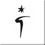
Interestingly he borrowed his mother's name, of which he used "G" for a signature, visible on his sketches for Dior, surmounted by what seems to be a star based on an ink-splash (later he put this symbol on his Rolls-Royce, of all things!)
Using a heavier charcoal outline or thick paint brush was his signature look at an era that preferred watercolours and delicate delineations. It was his modernity that differentiated him and which was a companion till the very end, making his work seem current even today in a world that has practically seen everything.
Apart from Dior he also did illustrations for Balmain, Lanvin, Schiaparelli and his favourite, Balenciaga. He was also instrumental in trying to give a younger image to Givenchy couture. Not to forget his work for films (who can forget his "La Dolce Vita" or "French CanCan" art posters?)and for "glossies": Flair, Vogue and Harper's Bazaar. His provision for Moulin Rouge and Lido remind us of another famous artist of posters with arguably low subjects turned into high art: Toulouse-Lautrec.
But his work for Dior parfums is crystallised someplace in the best part of perfume lovers' mind.
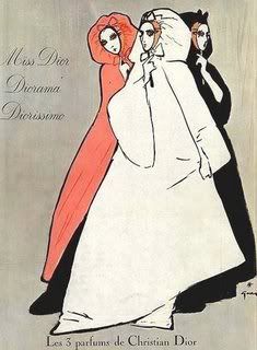
We can see in this not often referenced pic of the first three Dior fragrances that the three perfumes look to be embodients of three "sisters", dressed in comparable fashions: the outlines of the bodies hidden beneath meters of cloth, their heads clothed in loose hoods. The choice of rose, black and white seems to be characteristic of Gruau's palette, even to the modern day. Here they represent different olfactory profiles. It would be interesting to guess which is which! Of course the easiest one would be to attribute white to
Diorissimo, it being a more virginal lily of the valley scent (although, not quite!). But which is
Miss Dior and which
Diorama? Therein lies the charm.
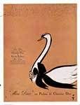
"Some of his artworks were what we now call "brand images" - the pearl-necklaced swan he dreamed up for
Miss Dior perfume after Dior gave him a whiff and a briefing" (quote from the Guardian article above). Here it is from 1950. A true classic, just like a string of lustruous pearls on a delicate lily throat.
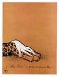
However apart from vulnerability, there is also the hint of the animalistic in
Miss Dior that is so evocatively suggested in this 1949 advertisement: a woman's hand resting on a leopard's paw. The long fingers of a pale feminine hand resting on the spotted fur. Elegance and ferociousness rolled into one burst of olfactory mirth; like the glorious parfum itself!
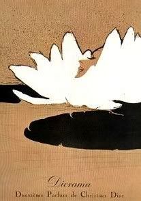
In 1950 he draw an image of a woman almost melting into a what seems like a giant white lotus flower in a pool of black ink. It also vaguely reminds us of the pon-pon of dusting powder; which is not averse to the dry feel of chypré perfumes, of which
Diorama {
click here for review} and
Miss Dior are great examples, for which the ad was conceived (it run for both).
Gloriously simple, gloriously evocative.
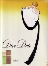
The elegant sweep of his intense brushstrokes can be seen in this
Dior Dior advertisement from 1978. The black "ribbon" both delineates the dress (witness the sleeve and the drape of the cloth sketched in a sweep) and his signature. I call this an apotheosis of design calligraphy. Don't you?
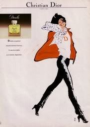
Diorella always had the air of independence and élan that is so characteristic to the French
parfum du jour. We might as well mention here that although France is considered to be the olfactory capital of the world, this by no means equals heavy bombastic perfumes being considered
bon chic bon genre for the day. It is much more elegant to save the romantic and seductive potions for the night, the opera and the ballet or the club than for the errands of the day. For those instances classy BCBG Parisians opt for something light and zingy, like
Diorella. {
click here for review} And which image denotes an active woman off to town better than this one, pants and boots encasing dynamic gams, sketched by Gruau?
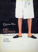
"He limned sexy gentlemen's limbs for the men's range
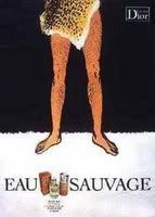
Eau Sauvage far into the 1980s" (quote from the Guardian article above). And what an intriguing idea this is! It hints at both mystery (the hidden torso and face) as well as virility (the hairy legs). This came out in 1966. They just don't make them like this anymore... On a subsequent image from 1970 (interesting to note that by then the sexual revolution was in full swing), the white bathrobe is substituted by a piece of furry hide that plays upon the "sauvage" (=wild) connotation.
Less intriguing than the previous incarnation, but just as playful.
"Perhaps this latter image would befit the 1980s flanker
Eau Sauvage Extreme to a T, in its black opaque bottle and ferocious name. The white bathrobe however wasn't abandonded, resurfacing again in 1971, 1977 and 1978. Some things are just too good to let go!
A great artist and a witty man, to be sure.
If I have persuaded you to take an interest in this artist's work, take a moment to revel in
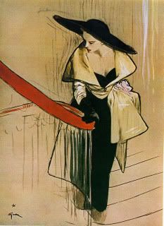
these glorious fashion sketches....We will
continue with the Dior chypres shortly. Stay tuned!
Pics from artnet, operagloves and okadi

.jpg)

.jpg)


Isn't Gruau's style loveliness itself? I've downloaded quite a few to put on my computer desktop. The Vent Vert is on right now, alternating with the panther and hand which has the mythical appeal of the Beauty and the Beast, as epitomises the soft/tough Miss Dior...
ReplyDeleteIndeed it is! I love to see them all the time as well. :-))
ReplyDeleteMiss Dior has this duality, which we both perceive, yes.
The Vent Vert ad reminds me of a sprite or a dryad. And the touch of the green hair is quite daring, considering. Then again we have the example of Beaudelaire, so...
I have loved his work since I was a young girl and if only I could show so much in such little strokes of line and paint as he did.
ReplyDeleteI cannot buy Diorella anymore in Australia. That was a sad day when they stopped importing it here. My favourite in our hot summer.
What glorious stuff! The definition of elegance. I've bookmarked the page you linked to. Thanks for a great post!
ReplyDeleteLJ,
ReplyDeleteyou said it so much better than me: "so much in such little strokes of line and paint"!
It is sad when something you love gets hard to track down, don't I know it! At least it hasn't been discontinued.
I am sure that Diorella is great for down under. I like it for summer too.
Dear M,
ReplyDeleteyou're very welcome. It was my pleasure.
I'm sure you will have lots of joy perusing the glorious images, like I did.
These are fa-bu-lous!
ReplyDeleteYes, D, they are!
ReplyDeleteBeautiful post, thank you ^_^ - V
ReplyDelete